Convey the right story and be connected to your branding -
Gold Coast business branding design and rebranding
When you start a business it is not uncommon to be passionate and knowledgeable about your trade, but its not uncommon to be inexperienced in the world of business or marketing. So many people use a $5 app or worse still use a template from vista print and use this to represent you. Neither option will be unique nor illustrate your value. In time with experience you realise it does matter what you look like and that your branding and marketing does convey a message. It does matter and will effect how profitable and successful your business can be. Please contact our Gold Coast branding designers and come on in for a free analysis of your business branding.
We like to start with you telling us your story, what makes you and your services unique, then analyse your target market, what makes them buy and ideally at the end of the day give you an identity that you feel connected to as well as one that works in the marketplace.
Green Mountain Meat - business Rebranding
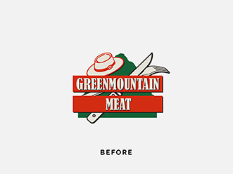
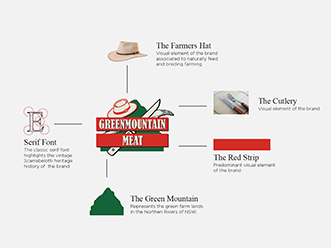
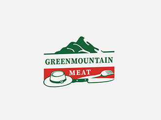
Green Mountain Meats are a well-established multi-generational family business with years of history and a visual identity that has a good following. They wanted to keep the elements of the past but make the logo more modern and easier to use when marketing and packaging their products. This is a great example of where a logo makeover keeping its brand recognition
|
|
|
Mayella - packaging Rebranding
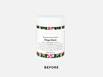
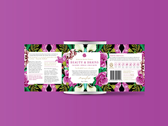
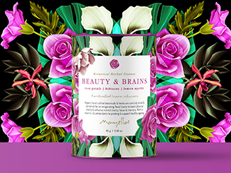
Mayella is an established brand of over 2 decades, a premium brand of Vegan Skincare, Nutritional Blends, Capsules and Herbal Tisanes. Having been successful in business for such a long time, Amanda the founder came to us looking to refresh their packaging designs to be more modern but still retain the essence of the old designs. Each of their products had been attributed with a particular background pattern over the years, so we kept these and refreshed the entire design starting with their nutritional blend range. Being a premium product, we kept a very clean but high end look through carefully considered layout and font use, and carried this through to the final product in printing with metallic highlights in their labels. This new Gold coast branding design has been carried throughout their tisanes and soon to be skincare, to bring all of their products to a look where they can compete in the modern marketplace. See Gold coast business branding design and full makeover
|
|
|
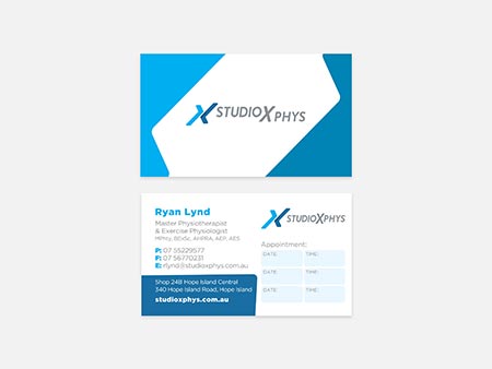
StudioXphys Physicial Therapist - Gold coast branding design
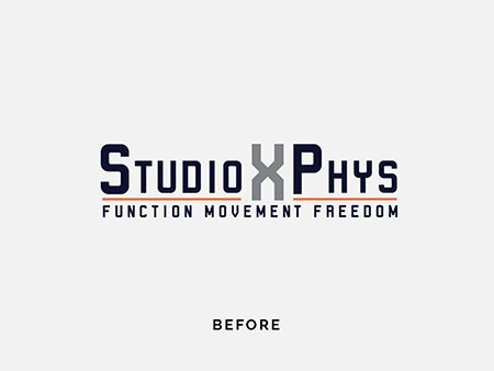
StudioXphys were looking for a signage for their new studio, and we realise that their current brand was not transmitting the soul and quality of the company. We end it up doing a whole rebranding job, upgrading stationary, business cards, gift card, car and signage. It was amazing working with Tegan and Corey and help them in their purpose. See the full design makeover project
|
|
|
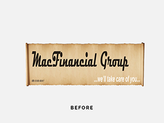
mac Financial Group - business Rebranding
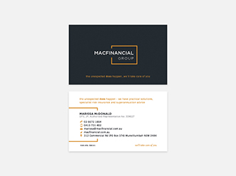
Peter and Marissa McDonald have been financial planners since 1989. They were looking for a more modern professional look. Gold coast branding design
|
|
|
wild nights party bus - Gold coast business branding design
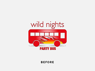
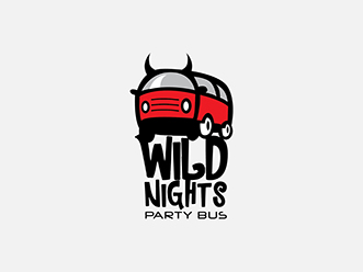
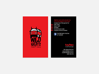
This is one of our favourite old examples. The original made in paint, therefore no files that can be used by professionals and it lacks the fun energy that you would expect from a night out on a party bus with your friends
|
|
|
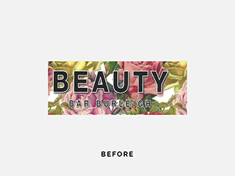
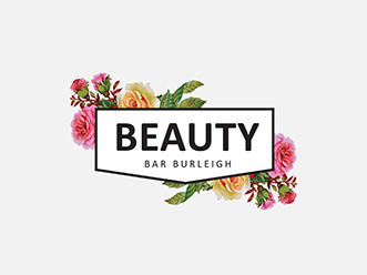
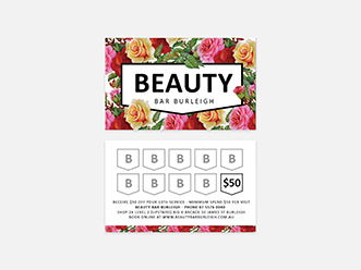
burleigh Beauty Bar - beauty Business Rebranding
Located in Burleigh Ell was revamping her interior design and general identity. Although she liked her current look the files where hard to use and the background being an image makes it hard to use standing alone (like on a shirt). We tried to keep with the look already established but make it more usable and legible without looking the customer recognition already established
|
|
|
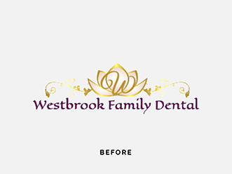
westbrook - dentist business Rebranding
Located rurally near Toowoombah it can be hard to access professional graphic design services. The client tried a cheap online option with everyone having input of their likes and dislikes. The original didn’t evoke the feeling of a clean professional dentist surgery. We have combined the Lilly (clients favourite flower that they had personally taken photos of to hang in the waiting room) with a tooth. The final Gold coast branding design outcome has a personal connection for them but also professional and tying into their service. See rebranding and full design makeover
|
|
|
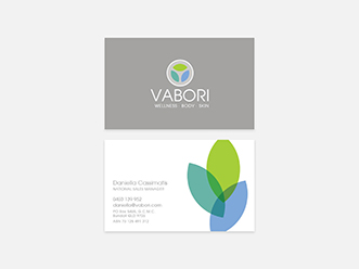
vabori - product Rebranding
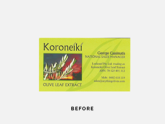
Vabori Olive Leaf Extract is Grown and Harvested on our Organic Family Owned Olive Plantation in Queensland, Australia. George believes in making their products as naturally, ethically and organically as possible. He was looking for an updated clean modern eye catching look to stand away from the current dated looking products on the shelf in his industry See Gold coast business branding design makeover
|
|
|
GREAT CUSTOMER SERVICE, CLEAR COMMUNICATION & ATTENTION GRABBING DESIGNS
“Gold Coast Graphic Design was able to take our abstract ideas then design logos and marketing materials that were beyond my expectations, and now has our small town talking about our new shop.They also saved me a lot of headaches by dealing directly with our sign writer to ensure the design would be suitable for our shopfront. The shop-front signwriting is done, still to do inside, but wow! How different does it feel to get rid of the old blandness and have it looking and feeling like a reinvigorated (but traditional) business.
Someone has nominated the shop for the Scenic Rim Business excellence awards in the customer service category but ALSO in the marketing category. Considering our marketing focus in these early days has been limited to positioning the shop type and to build a brand/image visually established by your hard work on the project, that is certainly a big pat on the back for your efforts and understanding of where we wanted to go with the business. Can’t speak highly enough of the great customer service, clear communication and attention grabbing designs.” - Jennifer Downes, The Butchery Canungra, www.thebutcherycanungra.com.au
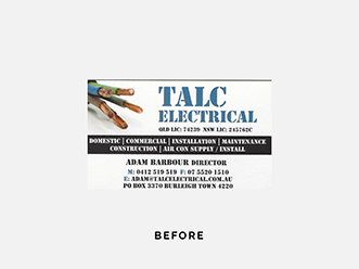
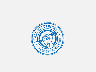
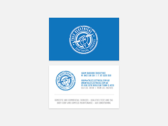
Talc Electrical - trady Gold coast branding design
Talc electrical were using a DIY design from vista print. He really was looking for a strong icon that he could use on his hats clothing and ute. . See rebranding and full design makeover
|
|
|
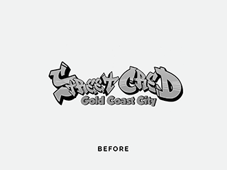
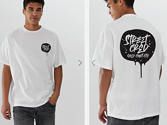
Street Cred - community service Rebranding
Project Street CRED – which stands for collaborate, re-engage, empower and deter, has been led by Gold Coast District (GCD) Police, Cross-Cultural Liaison Unit in partnership with, the Gold Coast Youth Service, Department of Child Safety Youth and Women, Department of Youth Justice and Keolis Downer – Glink. Designed internally it lacked a look modern youth would connect with
|
|
|
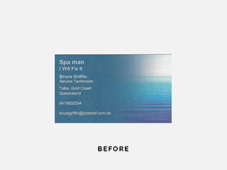
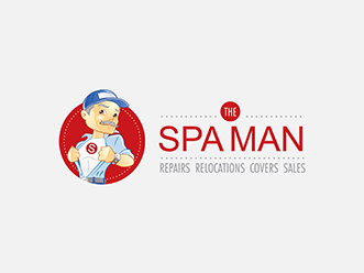
The SpaMan - Gold coast business branding design
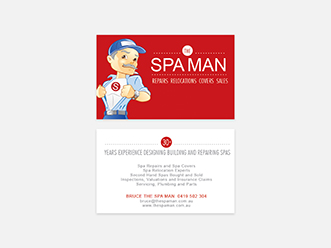
Bruce has been servicing spas for many years and established himself through doing a great job. But his business card being a template from vista print could easily tie him to other businesses with not so good reputation (as it’s the same). Looking to have an identity of his own we were able to purchase an illustration (keeping it cost effective for him) and change it to have grey hair and a moe to match his iconic handsome appearance
|
|
|
Roof Ninja - business Rebranding
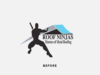
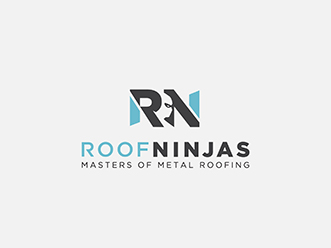
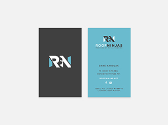
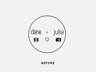
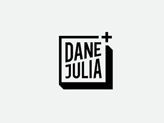
Dane was looking for a higher profile in his business and wanted a more professional look. He liked the idea of still keeping the roof, colours and the ninja.
|
|
|
Property Floor Plans - business Rebranding
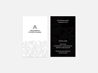
Peter was looking for a sophisticated look that didn’t necessarily have a high rise development look. Also wanting it to be less generic to the clip art style logo format See Gold coast branding design and full design makeover
|
|
|
Dentist - Gold coast business branding design
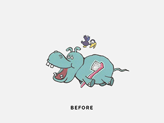
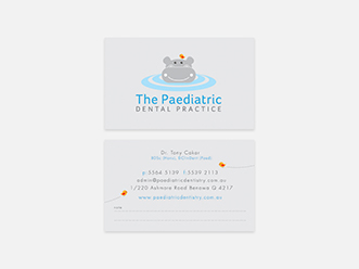
The clip art used originally was small and not a file usable by professionals for signage/uniforms/etc. They were also looking for a more friendly hippo to appeal to kids, as well as a professional look putting parents minds at ease
|
|
|
New Wave - Plumbing Rebranding
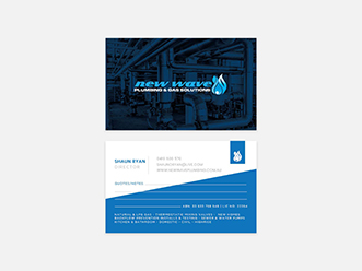
New Wave didn’t really have a logo, just a template from vista print that didn’t work to give them an identity that they could use easily on shirts, utes and other marketing
|
|
|
THE WHOLE PROCESS WAS DONE IN AN OPEN, FRIENDLY & EFFICIENT ATMOSPHERE
“After starting my own electrical contracting business last year, it had progressed to a stage where I needed to take it to the next level. My idea was to sharpen my businesses image and focus its direction. This is where I enlisted the skills of Kelly Robinson at Gold Coast Graphic Design.
After an initial consultation at her office, we formulated a new business name and a logo that was clean and sleek. Through various emails and telephone discussions we tweaked and tuned all the facets for my businesses re-vamp. This included: various logos for use as vehicle signage; work shirt embroidery and job site advertising banners; all stationery formating needs from invoices and letter heads; to job cards and risk assessment forms. During this process Kelly suggested the opportunity to produce some promotional flyers to further enhance my businesses profile. Since their launch, these cost-effective flyers have created a lot of interest and have paid for themselves in less than a month.
The whole process was done in an open, friendly and efficient atmosphere. I have absolutely no reservations in recommending Kelly and her staff to any business that is looking to progress their business to the next level. Great work Kelly!” - Mark Seller, Green Electrical
Medicinal Chef - business Rebranding
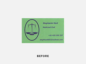
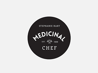
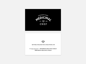
Steph had been using this DIY icon that didn’t really represent the direction she wanted to move towards. We did still keep her balance scales to have a tie to her past but her new look is clean and punchy. See Gold coast branding design and full design makeover
|
|
|
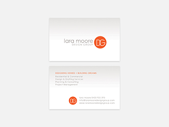
Lara Moore - Architech Rebranding
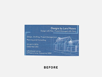
It is not abnormal for people when starting as sole traders to jump online to vista print to design themselves a card. The problem is many many other people use the same templates and there is nothing unique about this. It is not branding you and does not show your individual qualities. Gold coast business branding design
|
|
|
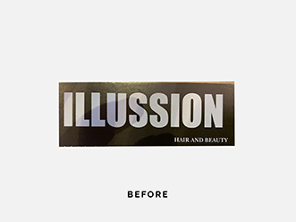
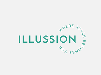
Illustion - beauty Rebranding
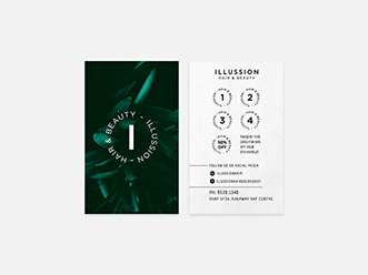
Illusion where using just a piece of type, nothing memorable or unique about it. There was no thought or planning behind the placement colours or style.
|
|
|
Holistic marketing - business Rebranding
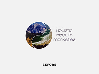
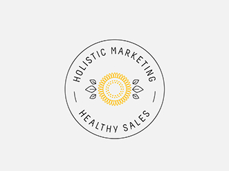
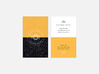
Holistic Marketing needed a new look with a more modern clean appearance. Also the image based logo was hard to use and reproduce
|
|
|
Himalayan Salt - salt packaging Rebranding
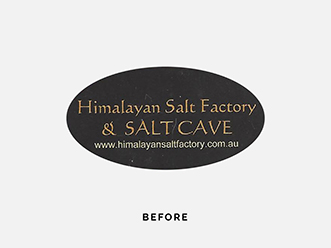
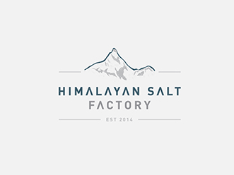
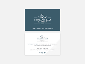
The Himalayan Salt Factory is the largest retail and wholesale Himalayan Salt supplier in Australia. The business had been going for some time, but Patrik was after a fresh new look. See Gold coast business branding design makeover
|
|
|
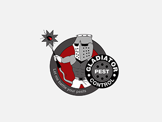
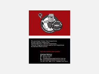
Gladiator Pest Control - business Rebranding
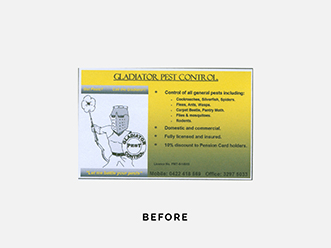
Andrew had a friend do his drawing and made his cards from paper. We cleaned his drawing up without loosing the essence of his mates drawing and printed them on top quality card. Gladiator Pest Control old logo design. See Andrew's full design makeover
|
|
|
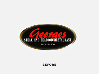
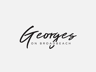
Georges on Broadbeach - Resturant Gold coast business branding design
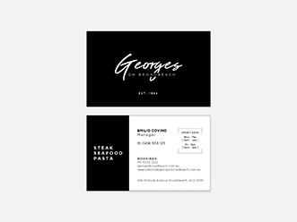
Emilio came in to just do a business card. We needed to recreate the logo for them as they didnt have the files, so we gave them a tweek of the logo at the same time
|
|
|
