What we created: When Jordan came to us to talk about his business idea we felt in love straight way. Easy Ride brand should appeal to an young / international student audience, be playful, easy recognizable and have a bran symbol which could have the ability to become and app or stand on its own – having that in mind, we design a bicycle icon with the “e+b” from electric bike or e-bike which also incorporate the infinity/renewable energy to the symbol. Expanding its branding we had design business cards, T-shirts, Bike Stickers, Bike Helmets, lanyard, website and shop signage.
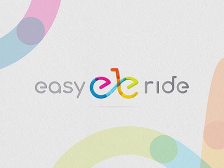
Easy Ride - Tweed Heads Logo Design

Easy Ride - Tweed Heads Branding Design
|
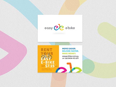
Easy Ride - Tweed Heads Branding Design

Easy Ride - Tweed Heads Graphic Design
|
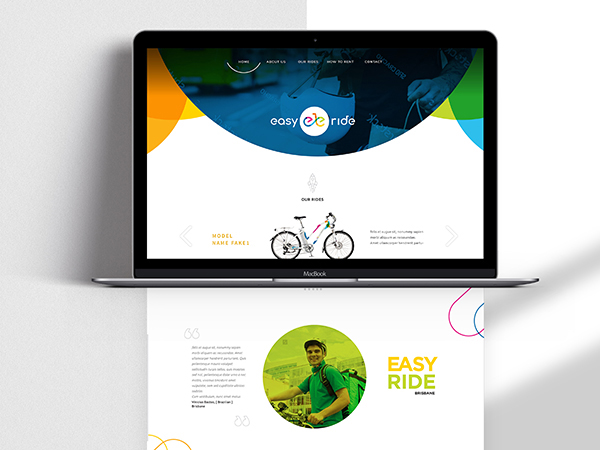
Easy Ride - Tweed Heads Website Design

Easy Ride - Tweed Heads Graphic Art
|
very passionate - this was reflected in the unique and incredible designs created
"The Team at Gold Coast Graphic Design, were a dream to work with. They are friendly, Professional and provided us with practical advice on what we needed. Our designer Isac is very passionate about his work, this was reflected in the unique and incredible designs he created for our company. We are very proud of Our Easy Ride Logo & Slogans & regularly receive compliments from our customers. If you want to take your business to the next level with experienced designers, Give GC Graphic design a Call!" Jordon, Easy Ride - Founder


.jpg)
.jpg)
.jpg)