While building their brand we felt the business name could easily translate the rational benefits of clean for the present, therefore we came up with “Smart Energy is Key”, playing with words / business names we could nail that brand message. However it still missing the emotional benefits; so thinking about the “decision makers” or the biggest influencers within the household we came up with, “Creating connections that Last.” ; Alongside with a picture of a mother and her child seating on the benchtop touching foreheads – A perfect combination to translate the message.
What we created: Design wise, we combine solar panels and Sun light to build an unique letter “K” for the brand symbol, and designed a customized a wordmark to reflect the same angles as the brand symbol. Move on with the branding, we carry the brand message and branding visual across stationary, website and sales materials.

Key Energy Logo Design
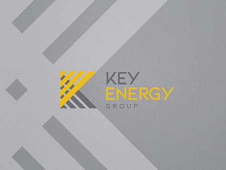
Key Energy Branding Design
|
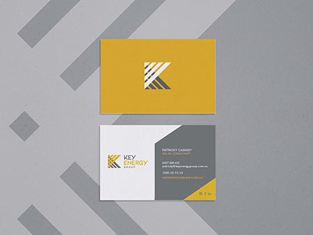
Key Energy Branding Design
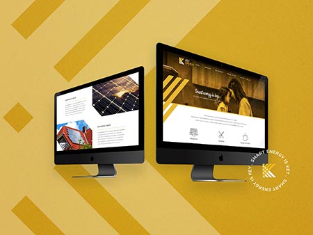
Key Energy Graphic Design
|

Key Energy Website Design
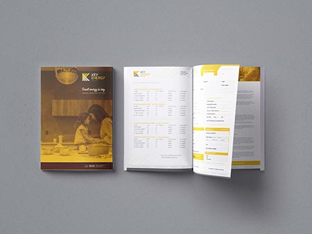
Key Energy Graphic Art
|


.jpg)
.jpg)

.jpg)